Southwark Council Adult Social Care Team requested a set of leaflets to raise awareness of the services provided to adults by the 'Reablement Team'.
The concepts couldn't use photography and adopted a bold and graphical approach which also helped the material stand out in a sea of information in waiting rooms.
Client: Southwark Council – designed whilst at Lichfields

Above: Concept 1 - exploring the use of speech bubbles to imply a friendly service and it's ok to open up and talk.
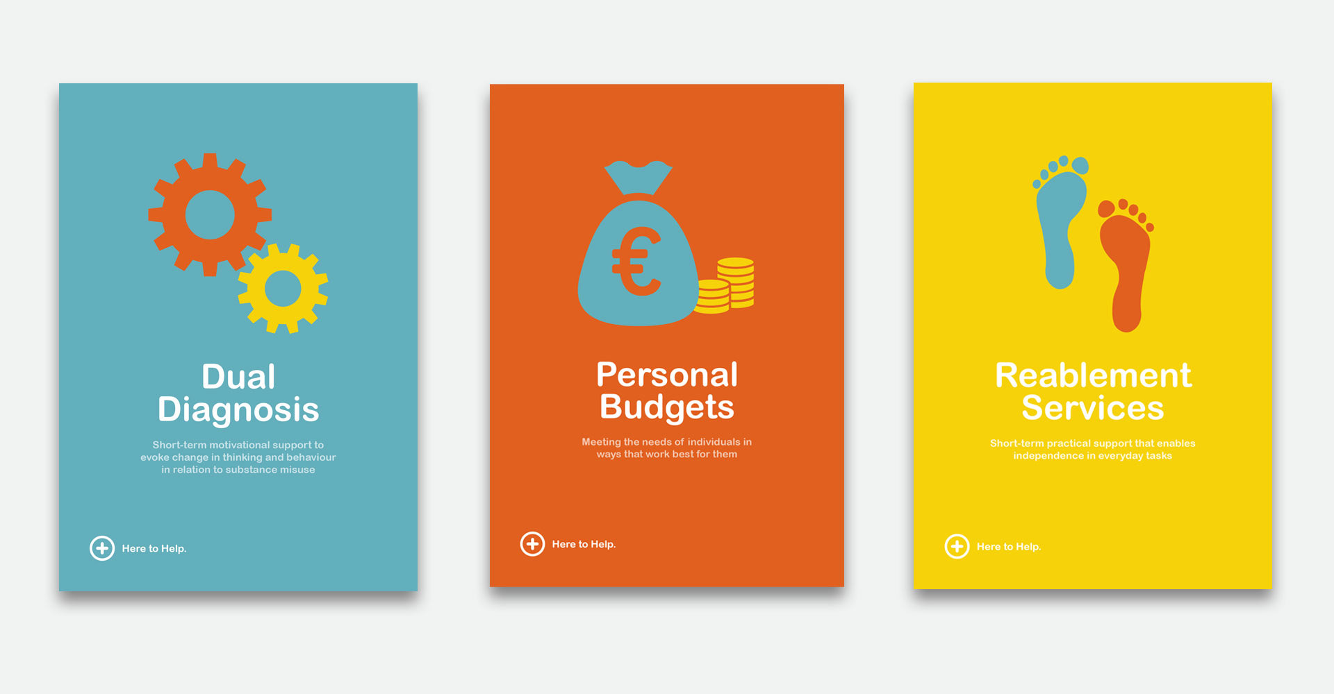
Above: Concept 2 - simple graphics to aid the service that is being portrayed.

Above: Concept 3 - using graphics of people without gender, race or age being identified to highlight that these services are provided for everyone.
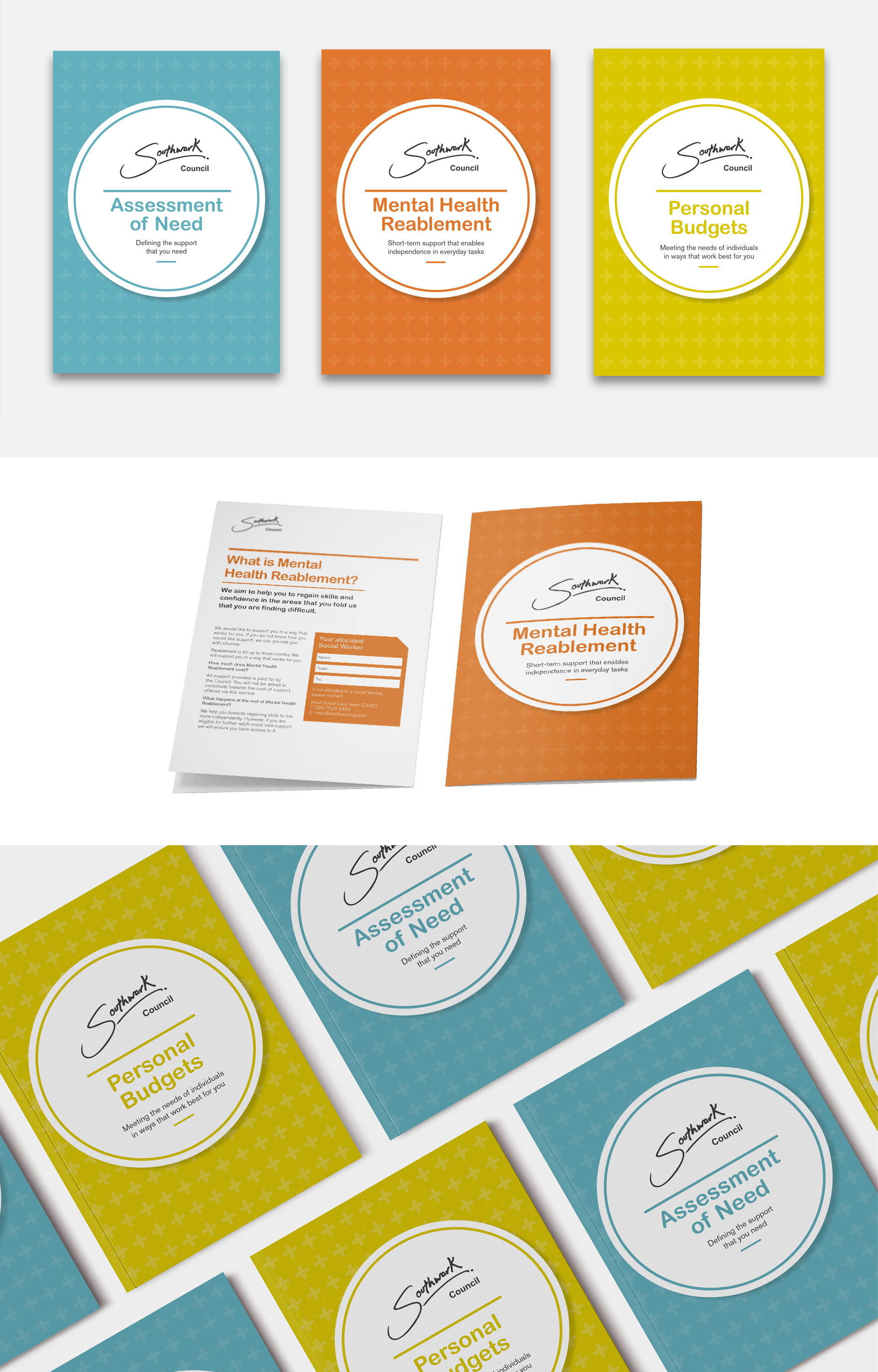
Above: Final chosen concept - Southwark Council wanted their logo to be at the forefront. A subtle pattern containing a cross that universally represents 'help' was applied. Simple, clear typography was selected to make the information as easy to read and be digested by the end user.